ListView Control

A ListView control displays a list of items with associated icons.
Client support
 Newlook Smartclient only.
Use
A ListView control can be used to create a user interface like the right pane of Windows Explorer. It is useful if you want to present data to the user in some sort of tabular format.
The key property of the ListView control is ListItems, which contains the items displayed by the control. The user can select multiple items, for example to drag and drop several items at a time to another control, if the MultiSelect property is set to true. The ListView control can display check boxes next to the items, if the CheckBoxes property is set to true.
Material skin considerations
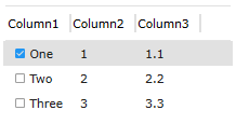
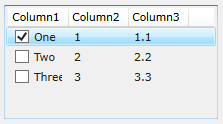
When the material skin is enabled in your solution, list views will be rendered with material styling. The most noticeable difference is an increase in the spacing within the list. If you have checkboxes enabled, then they will be rendered with the material primary color in the selected state.
|
Material skin |
Classic skin |
|
|
|
 Common ListView Tasks
Inserting a ListView control
- Open the relevant screen
in Designer (
 )
mode.
)
mode. - Select Insert | Other | ListView ()
from the main menu, then use your cursor to draw the graphic area on the
screen.
- Set any relevant properties in the Properties pane. For more information on list view properties refer to properties section of the ListView Control reference topic.
Adding and removing list items manually
- In Designer, select the ListView control.
- Add one or more columns (the number of columns that will show in your ListView control will depend on the View property value. To do this click on the ColumnHeaders property prompt button (
 ) to open the Column Collection Editor
 - Click on the ListItems property prompt button () to open the Item Collection EditorShow Items Editor
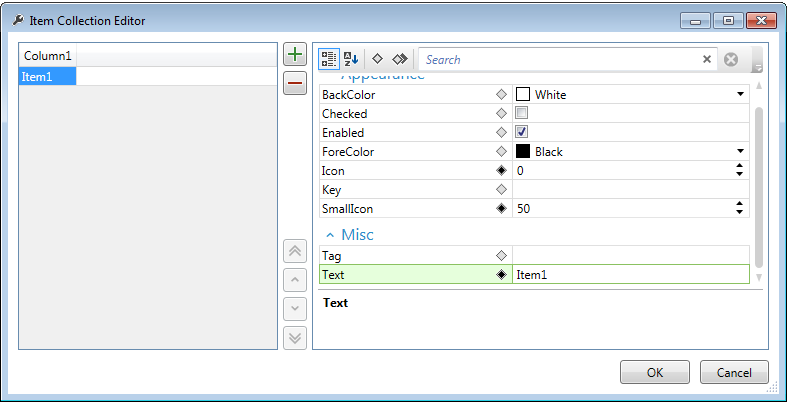
- Click the Add
 button and type in the text of your first list item. Modify any properties of this list item.
 - Add a sub-item by locating your cursor in the cell to the right of the list item and set its Text property (you will need to have created more than one column and set the View property to ViewReport to view sub-items).
Adding and Removing list items dynamically
Additional list items can be added to a ListView control's ListItems collection via the Add method. To remove all items from a ListView use the Clear method, to remove individual items use the Remove method.
Setting the view mode of the list view
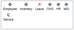
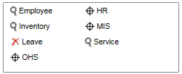
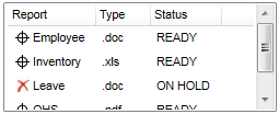
A list view control can display in four different modes as specified in the View property: ViewIcon, ViewSmallIcon, ViewList and ViewReport
|
|
|
|
|
ViewIcon |
ViewSmallIcon |
ViewList |
ViewReport |
Properties
Newlook Smartclient |  Newlook Server |
  Deprecated
|
Deprecated
|  Obsolete
|
Property |
Client |
Description |
|
|
Returns or sets whether users can reorder columns in report view. |
|
|
|
Specified whether the control will allow files to be dropped onto it. |
|
|
|
||
|
|
Determines the background color. |
|
|
|
Returns or sets the border style for the control. |
|
|
|
Sets or returns the Coded Character sets Identifier. |
|
|
|
Returns or sets whether a check box is displayed next to each list item. |
|
|
|
Collection of column headers. |
|
|
|
A collection whose elements represent each file dropped onto the control. |
|
|
|
Determine if control can respond to events. |
|
|
|
Use bold text formatting. |
|
|
|
Use italic text formatting. |
|
|
|
Determines the font used to display text. |
|
|
|
Sets the size of the font to be used. |
|
|
|
Use underlined text formatting. |
|
|
|
Determines the foreground color used to display text. |
|
|
|
Sets or returns the current control index for an object. |
|
|
|
Gets or sets a value which determines if selecting a column will
highlight the entire row. Deprecated property. |
|
|
|
Returns or sets whether grid lines are displayed between
rows and columns. |
|
|
|
Sets or returns the height of an object, in pixels. |
|
|
|
Returns or sets whether column headers are hidden in report view. |
|
|
|
Gets or sets a value that determines whether the selected node or list view item remains selected when the control loses focus. Deprecated property. |
|
|
|
Returns or sets whether hot tracking is enabled. |
|
|
|
Icon image list |
|
|
|
Returns or sets whether the user can edit item labels. |
|
|
|
Returns or sets whether labels are wrapped in icon view. |
|
|
|
Returns the last ColumnHeader clicked. |
|
|
|
Returns the last ListItem clicked. |
|
|
|
Returns the index of the last ColumnHeader clicked. |
|
|
|
Returns the index of the last ListItem clicked. |
|
|
|
Determine distance, in pixels, between left edge of the control and left edge of its form. |
|
|
|
Collection of list items. |
|
|
|
Returns or sets whether the control supports multiple selection. |
|
|
|
Name used to identify an object. |
|
|
|
Gets or sets the macro or script to be run when the AfterLabelEdit event occurs. |
|
|
|
Gets or sets the macro or script to be run when the BeforeLabelEdit event occurs. |
|
|
|
Sets or returns the name of a macro to be run when the Click event occurs. |
|
|
|
Sets or returns the name of the macro to be run when the ColumnClick event occurs. |
|
|
|
Sets or returns the name of a macro or script to be run when the Drop event occurs. |
|
|
|
Sets or returns the name of a macro to be run when the GotFocus event occurs. |
|
|
|
Sets or returns the name of a macro to be run when the ItemCheck event occurs. |
|
|
|
Sets or returns the name of a macro to be run when the ItemClick event occurs. |
|
|
|
Sets or returns the name of a macro to be run when the ItemDblClick event occurs. |
|
|
|
Sets or returns the name of a macro to be run when the LostFocus event occurs. |
|
|
|
Returns or sets the index of small icons to be used in the list and detail views. |
|
|
|
Specifies whether the items in the list portion of a control are automatically sorted alphabetically. |
|
|
|
Returns or sets the column to be used for sorting. |
|
|
|
Returns or sets the sort order. |
|
|
|
||
|
|
Returns the tab index of the control. |
|
|
|
Determine whether a control can receive focus. |
|
|
|
Store additional information about an object. |
|
|
|
Determine distance, in pixels, between top edge of the control and the top edge of its form. |
|
|
|
Specifies an object's type. |
|
|
|
Sets or returns the name of a variable that stays synchronized
with contents of the control. |
|
|
|
Returns or sets the current view. |
|
|
|
Determine if an object is visible or hidden. |
|
|
|
Sets or returns the width of an object, in pixels. |
Methods
Newlook Smartclient | Newlook Server | Deprecated
| Obsolete
|
Property |
Client |
Description |
|
|
Ensures that the specified item is visible within the control, scrolling the contents of the control if necessary. |
|
|
|
Finds or returns a reference to a ListItem. |
|
|
|
Returns a reference to the first visible item in List or Report view. |
|
|
|
See Also
ListItem object | ListItems collection
© 2004-2021 looksoftware. All rights reserved.